Dear Data
-
This project was one of the first data visualization projects that I worked on. While I started the project with knowledge about the data analytics process, I was pushed to better understand how convey data through design. The weekly designs for the Dear Data postcards helped keep me in a consistently creative mindset. The project itself also taught me about how data applied to my daily life, and deepened my appreciation for analytics and visualization.
-
10 Weeks of data, primary sources
Stefanie Posavec & Giorgia Lupi’s “Dear Data”
The Dear Data project was originally started by Giorgia Lupi and Stefanie Posavec. They described their project as a year-long, analog data drawing project. This project was designed to communicate a story through weekly data postcards.
For our project, my partner and I followed weekly themes to highlight data sets in different aspects of our personal and academic lives.
After 10 weeks of sending postcards I was tasked to create a “Goodbye”. It was a goodbye to my partner, and my project, but also a piece that would cover what I learned through the project.
Goodbyes
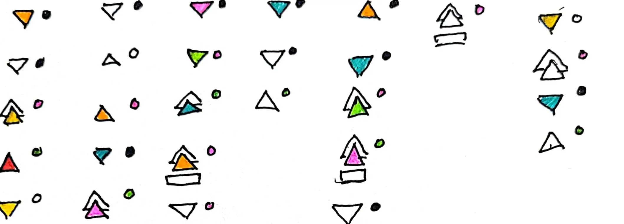
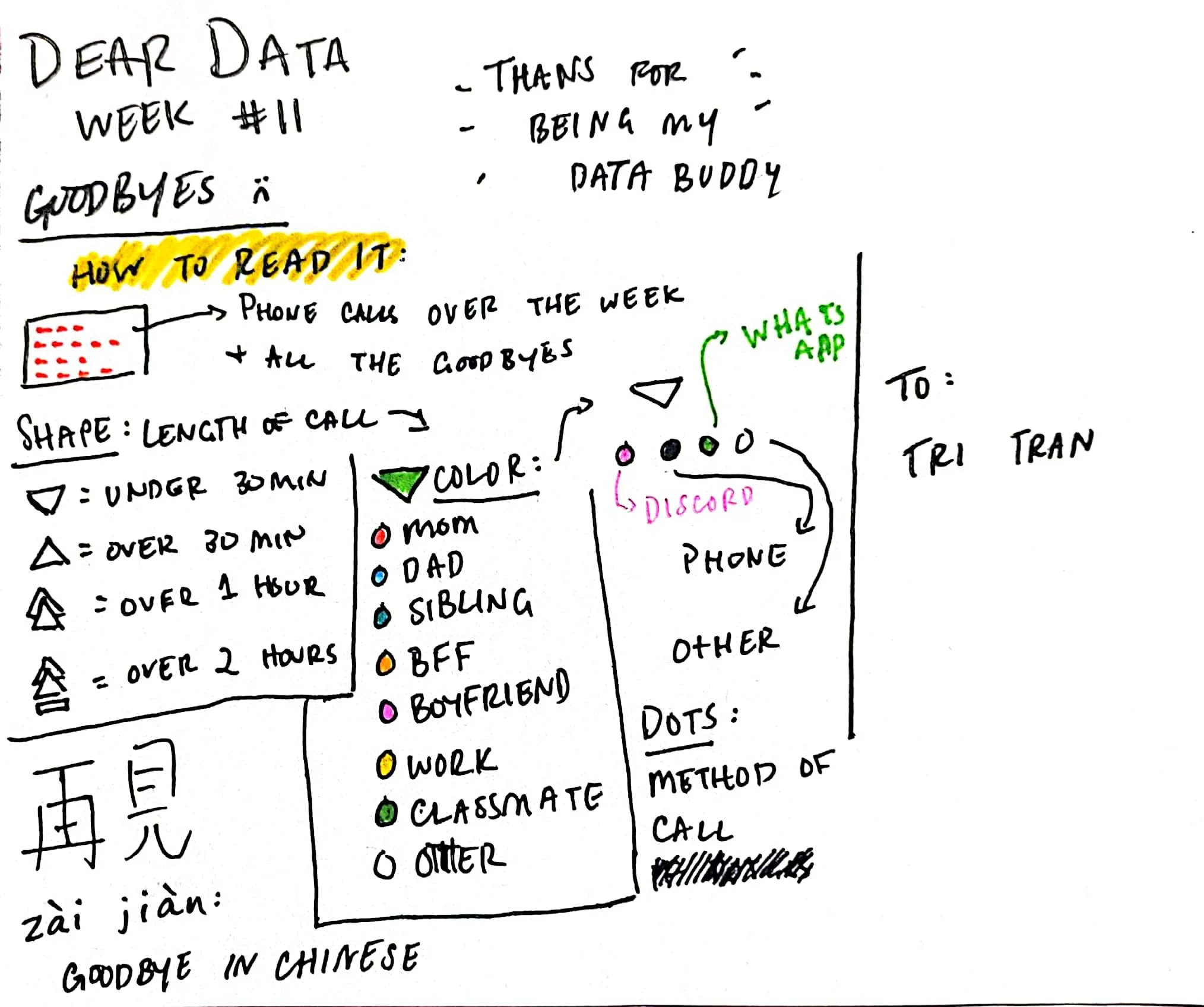
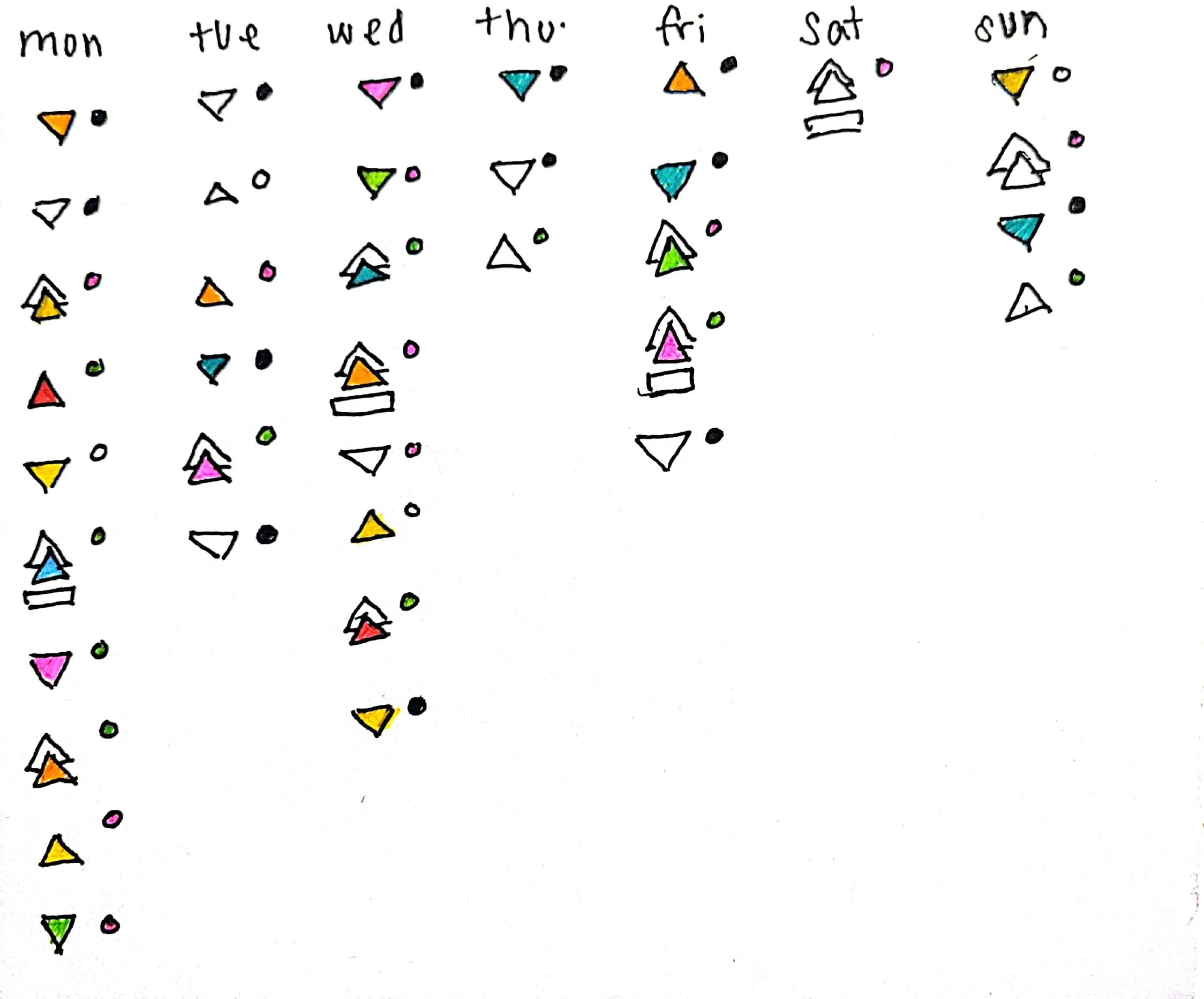
I really enjoyed making this final postcard because it really highlighted the personal experience of creating these weekly postcards. Since the theme was “Saying Goodbye” I wanted to focus on all the times I said goodbye that week. While the goodbyes I said weren’t final, they were the ending of conversations and left time for more communication.
At first I felt like breaking up the calls into different days was one of the most important parts. I chose to do 7 columns to represent the different days. Next, I had to actually consolidate my data. I realized pretty quickly that I needed to go through Discord logs (which proved to be difficult as I sorted through personal calls and server calls), Whatsapp, and my normal phone call log. The “other” category for the dots most comprised of Microsoft Teams and Zoom (neither of which I used often).
I then focused on organizing the data by the length of the call. As I went through my my compiled call log I then began highlighting the top 10 people that I was calling most often.
At first those people were my:
Mom
Dad
Older Sister
Older Brother
Younger Brother
JC (my best friend)
Boyfriend
Work people
Classmates
Scammers
I ultimately consolidated my siblings into one color, and decided that scammers would count for the “other” category (along with calling for appointments, my therapist, and whatever else).
Data Collection
Final Postcard
More Postcards
The research process was fairly unique since the research topic changed every week. There were also weeks that focused purely on data that I was personally collecting, while other weeks I would use more secondary data.
Guiding Questions
While the research topic changed every week, I still wanted to ask myself similar questions as I organized the postcard. As the project kept going I found myself asking more questions, and trying to make more detailed graphics. However, I still approached each postcard with the same couple questions:
What story am I trying to tell with this postcard?
What are the most important variables in this data set?
What design elements complement the theme for the week?
As I answered these questions I found myself beginning to brainstorm visualizations
Comparative Analysis
Beyond my beginning questions, I also wanted to understand the scope of my project based on the original project. Before I began designing any of my postcards I first looked through other Dear Data examples. I wanted to understand what made the postcards more effective at conveying information. Some elements I found effective were:
Wordless visualizations
Detailed keys/legends
Contrasting colors
Week Seven
African American Male Scientist
(checkout my coffee spill!)
Week Nine
A Week of Data


