COVID-19 Dashboard
-
This project helped me learn how to better utilize the Tableau software. I also had the chance to learn more about applying the data visualization process to a data set
-
My Role: Data Visualization Designer
Team Size: 5 Data Visualization Designers
-
Tableau
Languages
Python
This project was part of a Data Hackathon at Purdue University. Our goal was to create a data dashboard that would showcase the effects of COVID-19 for college classes. We wanted to see how students would rate their understanding of class material when taking the classes in person, online, or hybrid style. I worked in a team with 4 other students, all of whom were Data Visualization majors as well. We started the project by working with data given to us by our leading professor, then focused on analyzing the data. Our team wanted to see if in-person classes were better than online courses, and if COVID-19 was having an effect on higher education.
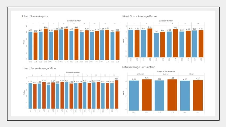
Our final dashboard showcased our analysis of 4 datasets. These datasets were from survey responses regarding the understanding of class material. The class material was specifically about how well students felt they understood the data visualization process.
Visualization Goals
Choose a color-blind friendly color palette
Clearly display data statistics between class sections
Highlight the teams ability to go through the data visualization steps
Results
The distance section is performing better than section 001 on all of the worksheets visualized
On average, the PARSE worksheet had the highest Likert scores
On average, the MINE worksheet had the lowest scores
A Likert score of 4 was equal to the answer ‘Agree’. This was the mode for all sheets/questions
On average, LC3 (the online section) had higher scores than 001 (in-person section)
Scores were not statistically significant, which concludes that there is no clear detriment to online classes
Assumptions: all of the students answered the worksheets honestly for accurate data
Data Collection
Final Dashboard
Secondary Dashboard
The data sets that we used for this project were provided by our professor, which meant we did not use primary data. The provided data was collected by our professor, from her students.
To analyze the data we went through the data visualization process:
Acquire | obtain the data
Used the provided data sets (worksheet answers from an online section - LC3, and an in person section - 001)
Used an extra data set from Johns Hopkins (global COVID-19 spread)
Parse | provide structure to the data
Organized the data into uniform spreadsheets
Filter | remove unnecessary data
Picked what data we wanted to cover in our visualization
Removed unnecessary, and unwanted, data
Mine | find statistics of the data
Found minimums, maximums, and means from the chosen data
Compared the statistics between the data sets
Represent | choose a visual type
Chose comparative bar graphs (this clearly showed the statistics for the two class sections)
Refine | make improvements
Worked as a team to create multiple iterations of the visualizations
Used meeting and team work to create our final visualizations
This data was pulled from Center for Systems Science and Engineering (CSSE) at Johns Hopkins University, and the World Health Organization (WHO).
In terms of the comparisons, we used Python to output our visualizations. These ranged from bar charts to heat maps. The ones that made the most impact, and gave the best insights, were the heat maps of the spread of COVID. It highlighted the rapid increase in the number of cases.
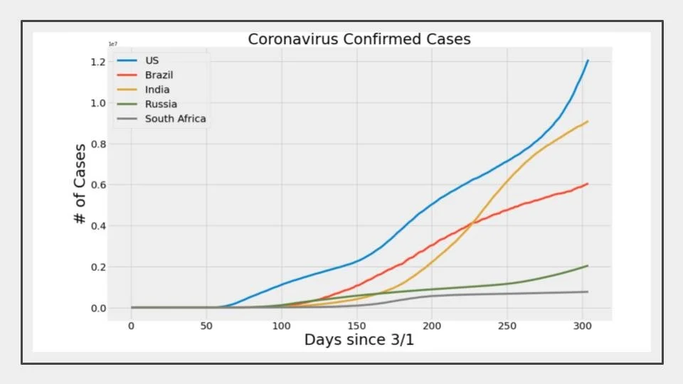
The other visualization that had a very deep impact was the visualizations of the confirmed cases and death tolls of 5 countries.
US
Brazil
India
Russia
South Africa
The charts highlight how different policies were mitigating the spread of COVID-19, which in turn lowered the death rate. These charts were adjusted to account for population differences.
We created a secondary dashboard with the same design principles as the first, but this one was going to be more focused on the global effect of COVID-19.


